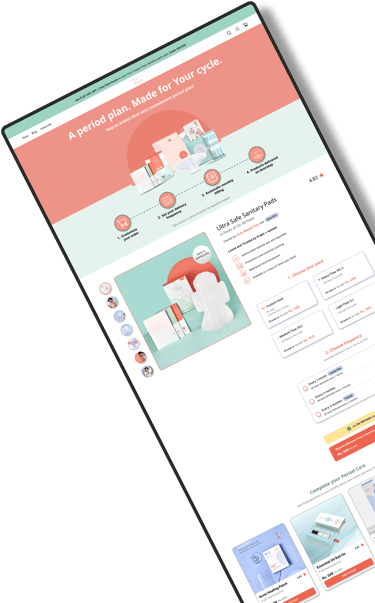
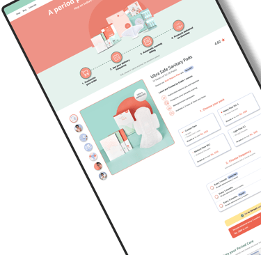
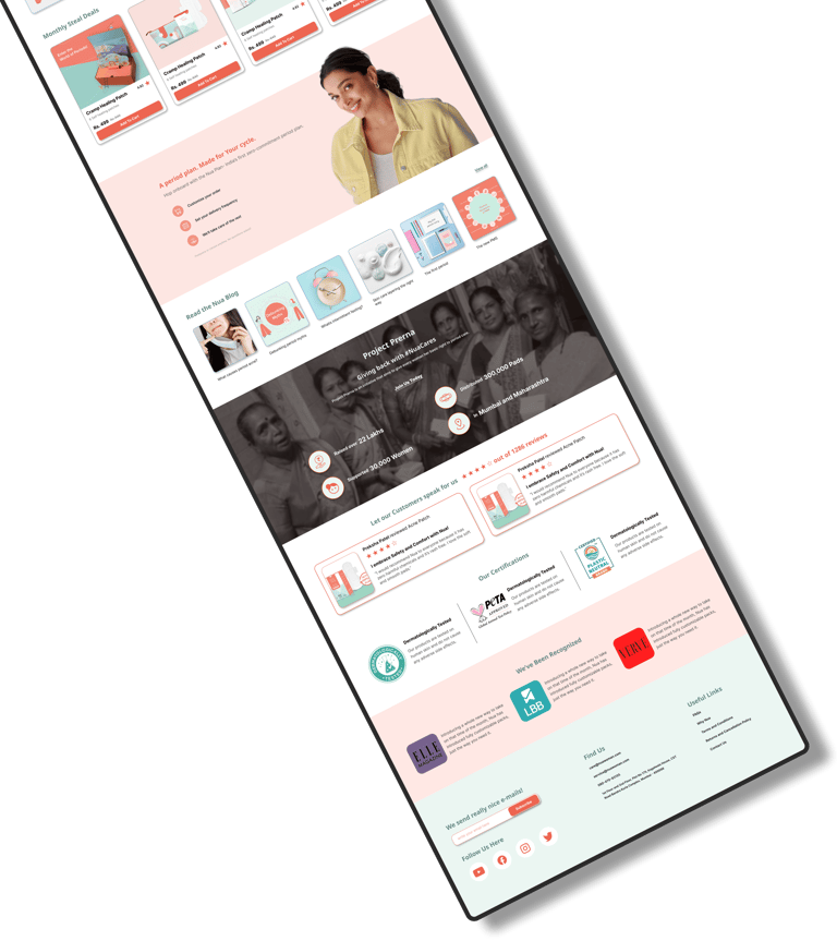
Redesigning an E-commerce website to enhance the User Experience by simplifying the Information Architecture and User Flow of the website.


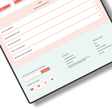
UI-UX Redesign
Nua Redesign
Website Redesign to Enhance User Experience
This is a hypothetical project to showcase my ability to redesign an existing product.
Time Line: 4 Weeks
My Role: Sole UI-UX Designer
Tools Used:


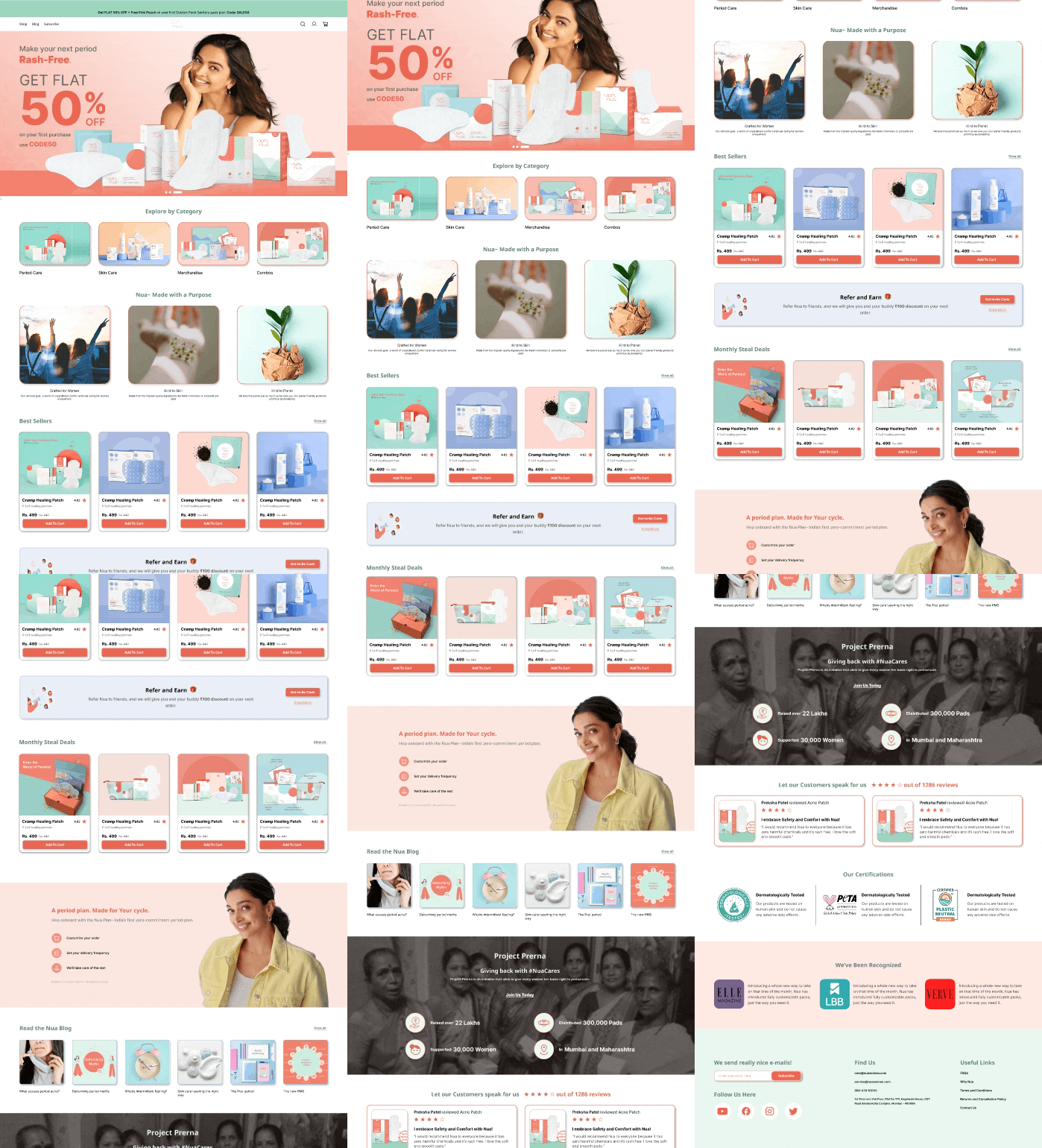
The Nua website is an e-commerce website with not efficient user experience and information architecture which led to confusion among the users resulting in drop of the conversion rate. My main goal was to make it super easy for people to explore and buy products. Through studying what users like and improving how information is shown, the aim was to keep people interested and help them find what they need. This project shows the step-by-step journey of turning a confusing website into a user-friendly space where everyone feels comfortable and can easily discover and buy great products from Nua.
Project Overview

User Research
Information Architecture
Wireframing
Prototyping
Visual Design
User Testing
My Role and Responsibilities
The current Nua website suffers from usability issues that hinder an efficient and intuitive user experience. Users find it challenging to navigate the site, leading to a significant drop-off in conversions. There is a need to transform the website into a user-friendly platform that not only simplifies product discovery but also ensures a seamless journey from visitor to satisfied customer.
Problem Statement
Solution Statement
Implementing user centric design to make the website and the shopping experience smooth and simplified by streamlining the navigation and clear product presentation.
Aims and Objectives
Aims
Enhance the overall user experience of the Nua website
Establish Nua as a trusted and user-friendly destination
Transform the website into a conversion-focused platform
Objectives
Improved Navigation
Clear Communication
Trust-Building Features
Intuitive Design
Design Process
My first step was to define the scope of the project through user research and competitive analysis. From there I defined a clear problem statement and moved forward with ideating the solutions. I took inspiration from the double diamond design method for the project as it has a user centric approach. After the ideation process I wend ahead with concept sketching and wireframing before the final UI was built.

01
02
03
04
05
DISCOVER
User Research
Design Strategy
Competitive Analysis
DEFINE
IDEATE
DESIGN
TEST
User Persona
Empathy Map
Journey Map
Problem Statement
MoSCoW Analysis
User Flow
Information Architecture
Card Sorting
Concept Sketches
Wireframing
Visual Design
Prototype
Usability Test
Iteration
Final Design
Competitive Analysis
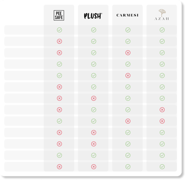
To redesign the website I needed to understand how the current products that are addressing user's needs, and to identify area of potential growth, I started with the audit of features provided by the competitors websites.
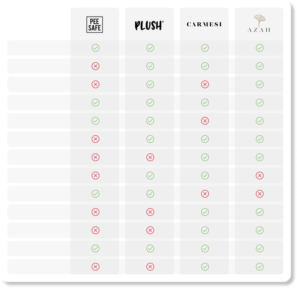
Search Bar
Personal Profile
Blog
Offer Bar
Onboarding
Categorization
Testimonials
Purpose Convey
Search Filters
Short Shopping Card
Visual Hierarchy
Best Sellers
Community
Business Intent
The business intent for Nua is to establish itself as a premier destination for personal care products in the Indian market. This includes a focus on enhancing the online shopping experience for users, driving customer satisfaction, and ultimately increasing conversions. The Nua redesign project aims to address usability issues, improve website navigation, and present products in a clear and compelling manner. By doing so, the business intends to not only meet the needs and expectations of its target audience but also to differentiate itself in the competitive landscape, fostering brand loyalty and long-term customer relationships. The overarching business intent is to position Nua as a trusted and user-friendly platform for personal care needs, contributing to its growth and success in the market.
To define the scope of the project and begin the design process, I used 5W framework.


Who?
This website is primarily for women from age 15 to 55 who use intimate sanitary products and skin care products, who are interested in discovering safe and sustainable period products and keen for learning about period health.
What?
The project aims to enhance the user experience of the Nua website, focusing on intuitive navigation, clear product communication, and a visually appealing design to increase customer satisfaction and conversions.


When?
The app will be used on commute to and from work, in the evening, during lunch breaks. Likely high on weekends and night time for purchase or to look for new articles or information regarding period health.


Where?
The website allows its users to easily shop and learn from anywhere where they can connect with the internet, weather with a mobile device or on a desktop.


Why?
The redesign is driven by the need to address usability issues, improve the overall user experience, and establish Nua as a leading destination for personal care products in the Indian market. The goal is to drive customer satisfaction and increase conversions.
For the qualitative research, I interviewed 20 participants out of which 10 were existing users of the Nua website through Critical Incident Technique and 10 users were of the competitive product websites through Cognitive Walkthrough method. I conducted one on one in depth interviews to find the pain points and to strategize the redesign such that it increases customer satisfaction.
Qualitative Research




"The information on the shopping card seems so overwhelming! I am not able to figure out instantly the relevant information."
"I wish they would have made it easier for me to discover some basic articles. Its too many steps and very confusing actually to try and find one."
"No I have never read this all information, I mean common it feels like I am about too read a textbook!! Its not in a fun or engaging manner."
"Its just too many steps I think. I love the product but I would just order it from Amazon. Its easy and quick that way."
" I really did not understood all the products or services they are offering at first. You have to dig in a lot to get clarity on that. It could have been more clearer."
Based on one on one interviews an online survey was conducted with a larger group of users. This gave me more confirmed insights on the pain point of these individuals which plays a huge part in the research. 88 responses were collected during the user survey.
Quantitative Research

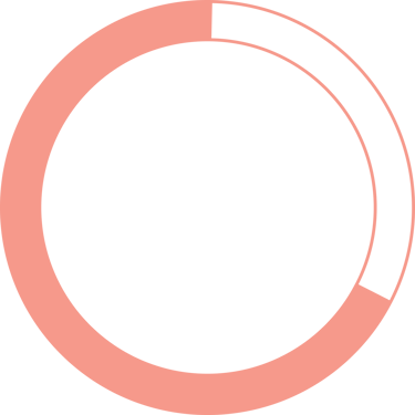

57%
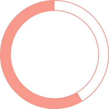
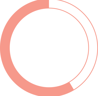
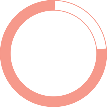
Of the participants thought that the current website was not intuitive enough.
78%
69%
Of the participants felt that the shopping cards were too long and difficult to read.
Of the participants found it difficult to discover certain products on the website.
Affinity Mapping
We have made quality our habit. It’s not something that we just strive for – we live by this principle every day.
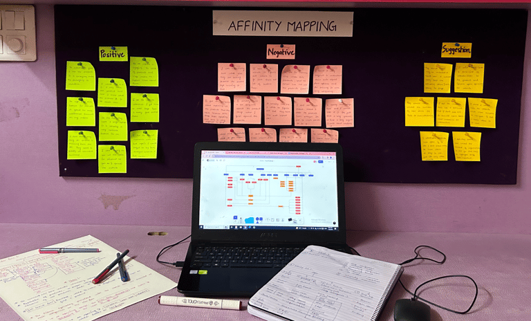
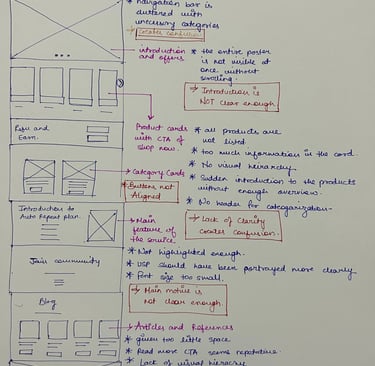
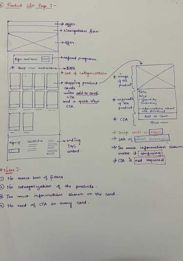
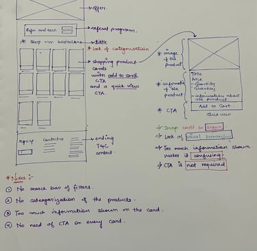
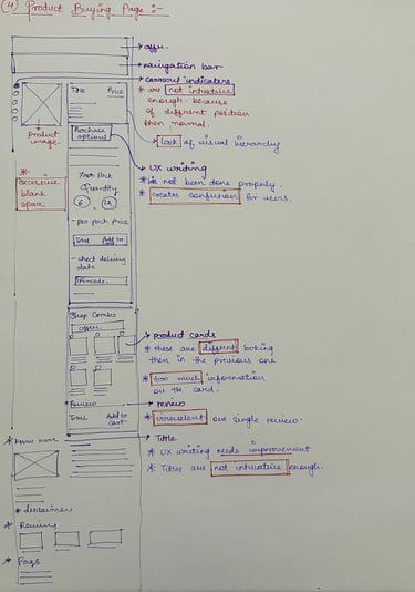
To understand in depth about the pain points inferred by the users, I studied the existing frame work, user flow, Information Architecture and the UI of the existing website. It helped me in figuring out and pin pointing the flaws and problems which needed to be rectified.
User Persona


Anita
23Years Old
Assistant Architect, Low Income
Wants to explore and discover all the options and relies on rating for decision making.
Often looks for offers and discounts before making the purchase.


Raj
32 Years Old
Product Manager, Average Income
Wants access to informative and easy to understand articles on menstrual health.
Wants a quick and discreet check out process to make purchase for his partner.


Aayesha
44 Years Old
Home maker, Average Income
Wants a easy and intuitive process of buying menstrual products without any hassle .
She finds the testimonials very trust worthy and likes to read short articles on period health.


Aayesha Shah
44 Years Old

She/ her
Home maker
Works 8-10 hrs/day
Medium Activity



Goals
Simplified Product Purchases
Access Menstrual Health Education
Time-Efficient Online Experience
User-Friendly Learning Platform

Frustrations
Time Constraints
Limited Tech Knowledge
Lack of Clarity in Product Information
Inaccessibility of Reliable Information
"I want a quick and easy discovering and buying process"
Ayesha Shah, a 44-year-old homemaker residing in Hyderabad, Telangana, plays a pivotal role as a mother of two. With a high school education and basic smartphone usage skills for communication and information, Ayesha faces the challenge of limited tech knowledge. Her primary goal is to effortlessly purchase dependable menstrual products for herself and her teenage daughter, seeking a convenient online shopping experience. Additionally, Ayesha has a keen interest in expanding her knowledge about menstrual health and hygiene, with the secondary goal of finding accessible and trustworthy information. However, her limited time and technological proficiency pose potential frustrations, highlighting the importance of a user-friendly and time-efficient online platform to cater to her essential needs and educational aspirations.
Empathy Mapping


Expresses Concerns about Product Quality
Seeks Recommendations from Friends
Expresses Interest in Learning
Communicates Need for Simplicity
Says
Does
Online Shopping for Essentials
Seeks Educational Resources
Relies on Family Communication
Seeks Simplicity in Tech Use
Thinks
Concerns about Product Reliability
Curiosity about Menstrual Health Education
Tech Apprehension
Efficiency in Online Shopping
Concerned about Family's Well-Being
Curious and Eager to Learn
Tech Frustration
Time-Pressed and Busy
Feels


User Journey


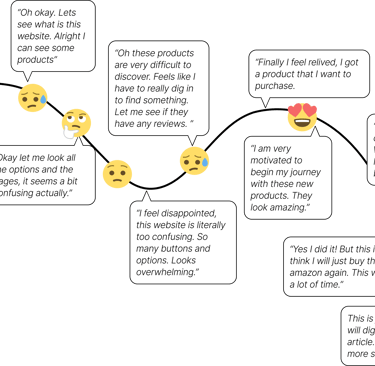
To understand this service from the user's perspective, I made this User Journey Map which describes the visualization of the steps taken by the users and the emotions felt during the same to reach the destination.
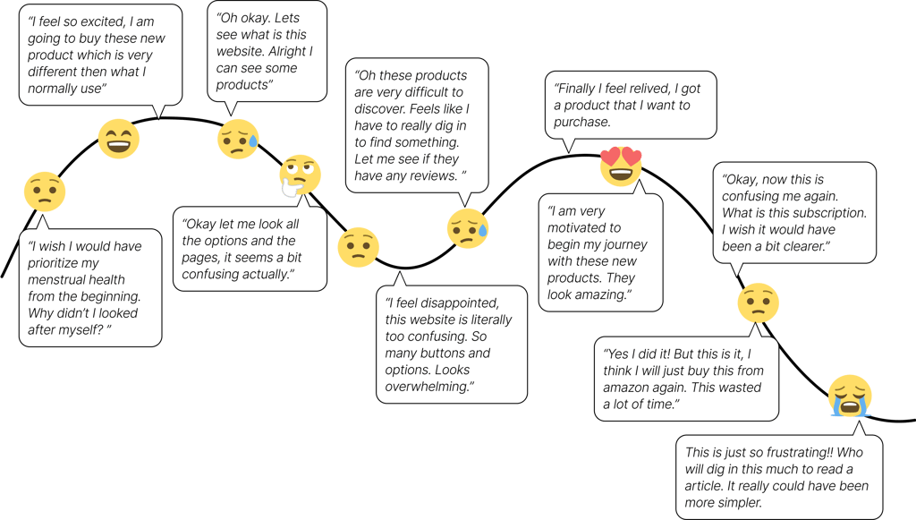
Consider
Explore
Compare
Finalize
Purchase
Opportunities:
Make simpler and cleaner interfaces
Design Intuitive user flows
Structure a clear Information Architecture
Improvise the UI writing to convey better
Introduce trust building features
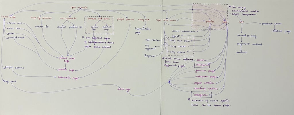
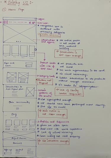
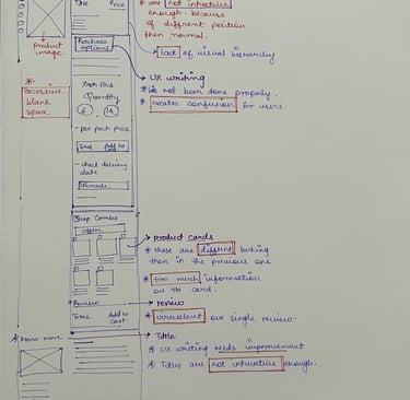
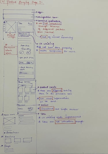
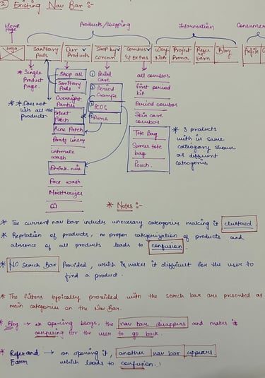
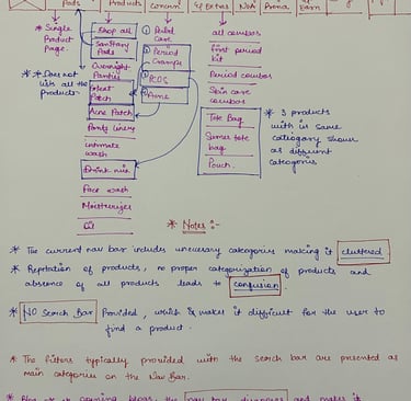
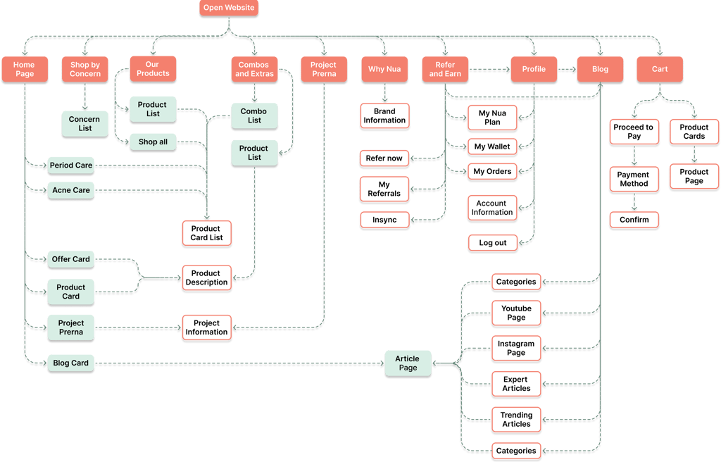
To understand in depth about the pain points inferred by the users, I studied the frame work, user flow, Information Architecture and the UI of the existing website. It helped me in figuring out and pin pointing the flaws and problems which needed to be rectified.
Existing Website Study

Existing Information Architecture
Existing User Interface Design
Simplicity
Key Insights


Intuitive
Visual Hierarchy
Clean UI
Interactive Design
For the qualitative research, I interviewed 20 participants out of which 10 were existing users of the Nua website through Critical Incident Technique and 10 users were of the competitive product websites through Cognitive Walkthrough method. I conducted one on one in depth interviews to find the pain points and to strategize the redesign such that it increases customer satisfaction.
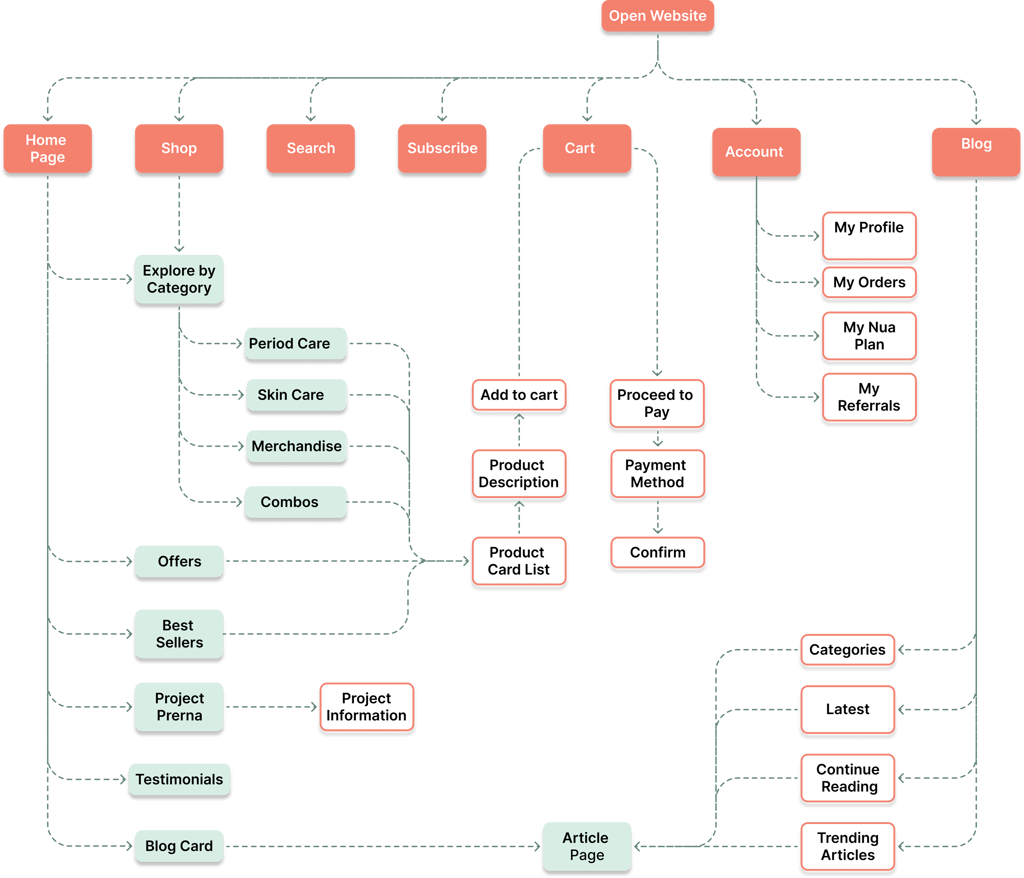
Information Architecture
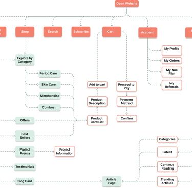
For the qualitative research, I interviewed 20 participants out of which 10 were existing users of the Nua website through Critical Incident Technique and 10 users were of the competitive product websites through Cognitive Walkthrough method. I conducted one on one in depth interviews to find the pain points and to strategize the redesign such that it increases customer satisfaction.
User Flow
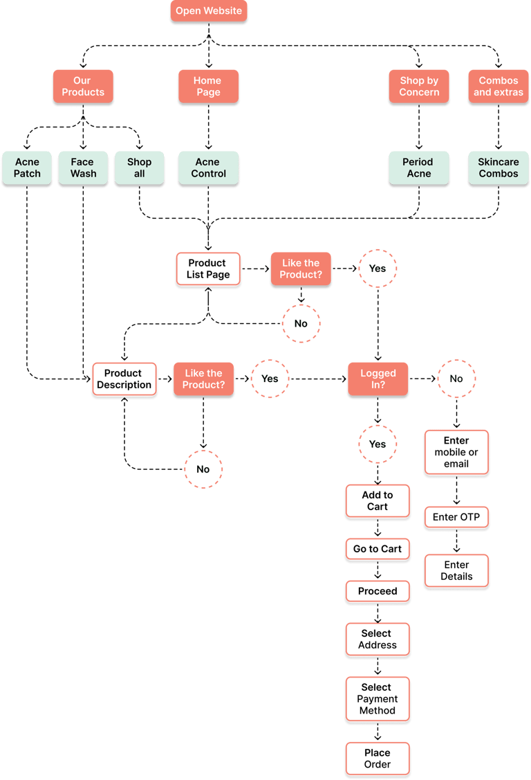
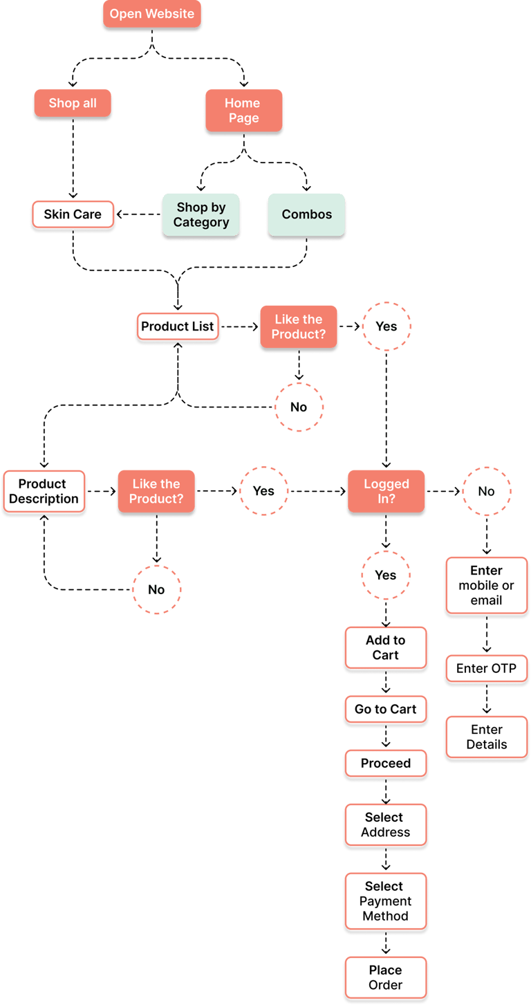
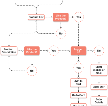
Existing User Flow
Redesigned User Flow
For the qualitative research, I interviewed 20 participants out of which 10 were existing users of the Nua website through Critical Incident Technique and 10 users were of the competitive product websites through Cognitive Walkthrough method. I conducted one on one in depth interviews to find the pain points and to strategize the redesign such that it increases customer satisfaction.
Qualitative Research


For the qualitative research, I interviewed 20 participants out of which 10 were existing users of the Nua website through Critical Incident Technique and 10 users were of the competitive product websites through Cognitive Walkthrough method. I conducted one on one in depth interviews to find the pain points and to strategize the redesign such that it increases customer satisfaction.
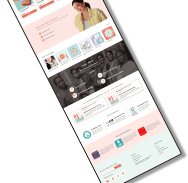
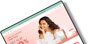
User Interface Redesign

